SerenityOS is a love letter to '90s user interfaces
Certainly the late 90s was the heyday of desktop consistency on Windows, in the 95/98/ME era, I think driven largely by the conventions Microsoft established in Office. And I believe Mac OS gave pretty good platform-level guidance then too, so things were generally okay with a few exceptions— stuff like media players that have always been more on the fanciful side.
MFC was Microsoft, so that was definitely native
Microsoft reimplemented this stuff from scratch all the time. Not just in MFC itself but Office too.
So, no, it was quite the opposite - it was uncommon to not rely directly on the basic OS widgets. Off the top of my head, the two toolkits that I remember that didn't do that were Borland's OWL (which quickly died out in post-Win16 era, since Delphi/VCL was strictly better), and Qt, which while not using native widgets tried to approximate that look and feel as much as possible.
Even in Java land, their first take - AWT - wrapped native widgets. It wasn't until Swing that they moved on to rendering their own, and it was widely derided as looking inconsistent with other apps as a result of that.
MS Office had its own UI toolkit and routinely invented new UI paradigms that weren't exposed in any Windows API, leaving people who wanted to look native scrambling to reimplement. This was particularly the case for toolbars. MS Office first invented the so-called "coolbar" and then the ribbon. Internet Explorer also rolled its own toolbar styles in ways not supported in the base Windows API e.g. toolbars with large icons and sliding sub-sections. Inventing custom toolbars was practically a sport on Windows; Netscape also did it.
At the time the most popular media players were WinAmp (totally custom and themeable to boot), RealPlayer (custom UI https://andrewnile.co.uk/blog/remembering-realplayer/), Quicktime (custom UI) and Windows Media Player (mostly but not entirely native).
Even the base utilities that came with Windows weren't consistent with each other. It wasn't uncommon in the Win 9x era to find programs still using Win3.1 style file dialogs ... a few are still buried in Windows today!
The problem got worse when you examined the artwork. The stock icon library in Windows was anemic, so dev platforms frequently had to expand the core library with their own. Delphi apps could be easily identified by the distinctive icons in their buttons (https://zarko-gajic.iz.hr/wp/wp-content/uploads/2017/02/delp...).
Restyling window decorations was also very common. Microsoft themselves did it routinely, for example their flagship Encarta encyclopedia app had totally custom widgets and window styling: https://winworldpc.com/product/encarta/1999
To get online most users were running something like CompuServe (custom web-style main UI https://thedayintech.wordpress.com/wp-content/uploads/2013/0...), or AOL (custom UI https://www.reddit.com/r/nostalgia/comments/ehxb1g/the_aol_h...), or MSN (custom UI https://cdn.prod.website-files.com/6179a66d5f9cc70024c61878/...)
%20(1).jpeg)
Windows apps of this era were much like web apps are today: they shared some common code for things like rendering menus, buttons or widgets in their settings screens, but the main UI users interacted with were almost always custom widgets that were extremely varied between apps. Win32 was nearly impossible to style compared to HTML so this represented a large investment of developer time, but a custom branded UI was believed to be worth nearly any cost. This is something fundamental to how humans work and is pointless to fight, a lesson the web platform fully embraced giving it an advantage over other UI toolkits of the era.
With respect to toolbars / coolbars specifically, one thing to remember was that those weren't kept for Office/IE use only, but rather shipped as reusable components ("common controls" etc), and so other apps could and did pick them up. Indeed, well into late 00s, the common fashion for Windows apps was to try to look like the most recent version of Office wrt menus / toolbars.
Also, I do recall that those apps which tried to look flashy with fancy custom styles etc were often perceived as unprofessional, and quite a few people (myself included) deliberately avoided them where possible - and it wasn't difficult to do, with natively styled alternatives readily available. I distinctly recall my own late-90s Windows desktop, and it was very consistent.
I'm sure people who care could make a consistent desktop, but our memories differ on how popular that was. The theming craze was a 90s thing, so even when apps didn't roll their own brand like MS themselves did, apps often let you apply custom themes to change the look.
In theory it's easier than ever to do that. You could create a browser extension that used user stylesheets to restyle websites to have a consistent look and feel. People make that effort to build ad blockers but not to build consistent looks, so I guess there isn't that much demand.
Because with the current status quo, the platform that dominates everyone's mindshare is HTML/JavaScript/CSS. Which has a really rudimentary concept of UI controls, and human interface guidelines that spend 90% of their effort on begging people to manually implement usability features that we used to get for free with native GUI toolkits. And I think that we might need to get away from that mess before it's possible for anyone to have any energy left over for worrying about HCI on the level that we used to in the late '90s and early '00s.
But realistically, you’re never going to stop a motivated app designer who is dead set on making their app an unique snowflake art project rather than a tool that users need to use.
But someone could just as easily respond to today's UIs with "Yes, it's wonderful that every single app looks identical, as if it was all designed by one pretty boring artist with no creativity whatsoever" and that would also be a perfectly valid take.
When I first used MacOS I was surprised about tute consistency to access the settings of every program, even third party, with the same shortcut cmd+,
Media software and game launchers were usually the worst offenders.
1. Companies will always want to brand their apps with their particular UI styles.
2. In order to prevent the above, the OS would have to deliberately NOT expose the ability for apps to control their own pixels.
Doing 2 means you are making it impossible to support many application types (photo editors, games, etc.).
NOT doing 2 means that app companies will eventually use the same APIs that the photo editor and game applications use.
And a lot of people have to use the applications as supplied, e.g. Slack or Microsoft Teams. Which can be accessed via a web browser, sure, but dedicated apps for these are also nice because they have a dedicated spot in the app switchers.
Nobody forces you to install and use apps made of a different toolkit (or version of said toolkit) from the one shipped with the desktop.
You can use only Cocoa apps on MacosX, qt6 apps on a kde plasma 6, gnome/gtk4 apps on a gnome3 desktop or whatever is the equivalent in the windows 11 world.
What I dislike the most on modern UI, and maybe absolutely hate, are all those super slow animations.
Slow animations are a way to hide latency, they are essentially loading screens. Apple is really good at it, or at least it was with the early iPhones, and a reason why iPhones felt so smooth compared to their Android counterparts while not being actually faster. For me, it is an impressive technical feat and it took years for Android to catch up (see: "project butter"), and in the end, it was mostly by brute force, i.e. putting ridiculously overpowered hardware in smartphones.
Remove the animations or make them faster (you can do that sometimes), and the lag may become apparent.
Why you have latency to hide in the first place is another problem. There may also be some clueless designers who put slow animations for no good reason, maybe because they are just copying Apple, not understanding why Apple did it in the first place.
Slow animations are a way to hide latency, they are essentially loading screens.
Except that most of the time there really isn't any latency to be hidden, the action becomes effectively instant once you remove the animation. Starting a new app (or switching to an app that was evicted from memory) is the main exception and that's quite rare.
For example the animation associated with minimizing windows in most desktop environments makes it crystal clear where your window went after you press the minimize button, even for novices. Removing that animation makes the interaction significantly more confusing.
Slow animations are a way to hide latency, they are essentially loading screens. Apple is really good at it, or at least it was with the early iPhones, and a reason why iPhones felt so smooth compared to their Android counterparts while not being actually faster.
Now it got flipped. I turned off animations on my Android phone, and it's great. And now every time I have to use iOS (for app development), everything seems to be moving in slow motion.
And you can not turn it off! Apple in their infinite wisdom doesn't provide ways for app developers to disable animated transitions.
I worked on an app in the iPhone 4S and Galaxy S II era and we wanted to use the same trick on both: smoothly animate the view switch between user interaction event and the API response. It worked super smooth on iPhone, and it was jittery as hell on Android. In the end we left the animation on the former, and move the users straight into the loading screen on the latter.
Remove the animations or make them faster (you can do that sometimes), and the lag may become apparent.
This is my number one trick on Android phones. Enable developer options and change the animation speeds from 1x to 0.5x. It makes your old phone feel new.
Apple is really good at it, or at least it was with the early iPhones, and a reason why iPhones felt so smooth compared to their Android counterparts while not being actually faster.
Is that why iOS animations always feel so slow to me? Modern phone hardware can do things so much faster, but the animations are still utterly sluggish in my opinion. Worse, there's no way to speed them up; even with reduced motion, slow movements are simply translated into just-as-slow fades, which are somehow even more obnoxious.
1. Replace the menubar with a hamburger menu; in some cases the hamburger menu then contains file/edit/&c. so it's just a spurious extra click
2. Require a click to see the contents of a submenu and a click to go back
Fortunately my most-used GNOME application (Evolution) has an option to restore the old behavior for both of those, but I literally cannot think of the motivation for these two changes that clearly make things worse. The only halfway plausible idea I have heard for #2 is that the GNOME UX designers think that submenus are bad, so if you make them hard enough to use, developers will stop putting them in their applications. #1 is probably partly a looks thing, and partly a "too many people have fewer horizontal lines on their screens than I did in 2004[1]" thing.
1: That's when I got a 1600x1200 monitor; people today with 1080p screens have only 56 more lines than the 1280x1024 monitor I had been using since the previous millennium
It’s unfortunate because in other ways I find GNOME/GTK more agreeable than KDE/Qt (layout of controls within windows is consistently better in GTK environments/apps for example, Qt apps have a tendency to feel slapdash/haphazard/“engineery”) but I don’t like the increasingly strong mobile influence.
My alternative to the menu bar would be a search bar that allowed me to search in a Google style everything related to that program: functions, features, shortcuts, and documentation.
File | Edit | View | etc. is not the right choice for every program.
Most would be better served by surfacing the most commonly used screens as tabs and most commonly used functions within those tabs. Ideally 2-4 taps is all it should take to get anywhere, and there should only ever be a tiny handful of niche things that take 5+ taps to access.
I’m also perplexed why the mail developers would allow such a thing or what kind of bug causes such behavior.
Certain long emails I get don’t show the scroll bar at all in iOS Mail, and I get low grade anxiety not knowing how long the email is or how much more is left.
Yet in iOS you can swipe vertically some pixels and you will see the scrollbar telling you this exact information.
I work in MacOS VSCode frequently, and whenever I open a large repo with a huge number of files, it's PIA to find the scrollbar. I have to hover the mouse above it to make it appear, but how can I hover above it without knowing where it is?
BTW if you share the same frustration with VSCode, please vote this ticket: https://github.com/microsoft/vscode/issues/244123
My pet peeve: Animations are a crutch used by designers who think they need them when in fact they should just have improved the UI so users don't get confused about the origin of a popup or window. The only justified use of animations in UIs that make sense is in scrolling, everything else is just adding latency to hide your incompetence.
If I offer to turn them off they often get surprised at how much faster the phone feels after.
If you're using Android there's also a "visible touches" option you can turn on in the Developer settings. It's a big UX enhancement of its own and IMHO should be promoted to the Accessibility settings (together with the options for speeding up or disabling animations).
Good font rendering
A large part of the charm of these 90s UI recreations is precisely the lack of antialiasing and other niceties we expect of modern UIs. There was another project recently on HN that uses modern font rendering with a Windows 9x look, and it's just not the same, IMO. SerenityOS comes closer to what I remember, though it still doesn't quite match the look of MS Sans Serif(?).
I still use chrome sometimes for example just because it seems to have a better font rendering (on Linux but also on Windows) than Firefox. It's completely irrational in a way but it does matter sometimes
What I dislike the most on modern UI, and maybe absolutely hate, are all those super slow animations.
This is what drives me crazy on macOS. Specifically, the animation for switching between virtual desktops. When I hit Ctrl+1/2/3/etc I want it to switch instantly, no animation - not slide into place. It's even unresponsive until the animation finishes.
Most animations can be disabled using the defaults system.
I think the desktop animation option is called workspaces-swoosh-animation-off or similar.
I also recall that Settings > Accessibility has a reduce motion option that disables lots of things.
My "solution" is to use Aerospace [0], which reimplements window management. That's the only way I found to not have animations. Unfortunately i still feel some delay when switching windows compared to i3wm/sway in Linux.
What I dislike the most on modern UI, and maybe absolutely hate, are all those super slow animations.
I get it, and I agree. But what I personally hate the most on modern UIs is hiding things. Why aren't my scroll bars visible when I'm not interacting with them (and even when visible, are ridiculously small and low-contrast)? Why does IntelliJ hide the buttons for interacting with tool windows until I mouse over where they should be? Why does MacOS hide my application launcher bar by default? Stop hiding things!
Not my favorite design and color scheme, but certainly better than what modern Windows looks like.
That has no direction and doesn't even look modern. And the line of text with "Windows Update is committed to helping reduce carbon emissions" is as superfluous as many other controls as well. I mean nice for MS, but it really doesn't belong there.
In my opinion, peak usability for platforms I use:
- iOS 6
- Windows 7
- Snow Leopard
- Windows Phone 10 (may actually have been the best mobile OS user experience I ever had)
The interface was incredibly fast and intuitive. It was slick and easy to understand but felt modern at the same time. The font felt timeless, it had the best camera app for the time, which was a time where amazing mobile phone cameras were just starting to become a thing (Nokia famously made a 42 megapixel camera for their flagship windows phone and the pics were gorgeous)
The first party software was really fast and stable. They were also some of the first phones I ever used with proper OLED screens
If you ever get a chance to use one it’s worth it even if it’s only for a day. Really changes one’s perspective on what’s possible with mobile devices. IMO nothing has captured that magic again
It's hard to put into words because you have had to use it to understand!
I despise Windows 10 Mobile though - it killed the whole platform and made the OS unbearably slow. It was full of bugs and it was clear that it was the beginning of the end for Microsoft's mobile amibitions. I use Android now but it's a mess. Google can't decide on a consistent UI + UX and everything is all over the place.
The UI was fairly consistent. There was no guessing what was a button, what an accidental drag would do, etc.
The live squares on the homepage, in my opinion, are still better than anything iOS has come up with.
One thing I don't think enough people mentions is the messaging app. It integrated with Facebook, before Facebook Messenger. This might not be a big thing today, with people leaving Facebook, but it was absolutely brilliant back then. Basically like iMessage, but with Facebook as the non-SMS protocol. I think it may also have integrated with LinkedIn, I don't recall, but it was suppose to just merge all your contacts into one messaging app.
As much as I dislike Windows on the desktop, Windows Phone made perfect sense. The UI was completely tailored to the touchscreen and was so easy it use and navigate. It's a real shame it didn't take of. In some sense Microsoft should have treated it more like Windows on the desktop and aggressively offered it to OEMs.
If the homogeny of flat design makes the main interactive elements less salient, then everything designed to look 3D with glossy surfaces and brushed metal outlines does the same, just with noise.
I think there should be a combination of both, which I think is why many find the older interfaces from the 90s and early 2000s much more usable.
That's a long way of saying that I prefer the flat application icons and dock on current macOS. The dock stays in the peripheral and the icons identify the application all while not drawing my attention until I purposefully go to it.
I think there's a place for flat design and it isn't all bad, in particular peripheral UI elements, like the top menu bar, dock icons
Funnily enough, these are precisely the elements that are flat in the Windows 9x look. (Windows 9x does not have a "dock" but it does have a quick launch bar and a system tray, and these show flat icons.)
Mavericks to Yosemite I would understand, but Snow Leopard felt like a strict improvement to me. What did it do wrong?
I felt the same way about XP, despite it being generally regarded as a UI abomination. I think it was just familiar.
Anyway, I eventually shook lose of that nostalgia, and for me the best usability has been more recent. The wmii/i3/sway family of window managers are have been just great: simple, to the point, and automatic.
I dunno. There are pretty clearly some bad trends in computing generally and mainstream UX specifically, but improvements are still bouncing around in the margins.
Are you saying those elaborate 90s style window menus are somehow simpler than iPad interfaces?
Current interfaces are generally a lot more simpler than those ones though?
Unless and until you need to do something that isn't one of the three or four basic functions.
Are you saying those elaborate 90s style window menus are somehow simpler than iPad interfaces?
A perfectly-designed window menu is going to be simpler than a perfectly-designed iPad interface. There's only so much you can really have access to in iPad/Android-land, and any functionality that can't be encompassed with tap/long-tap/tap-and-drag is going to require a drastic break from the ordinary functionality. With window-menus, since you're already using window-menus for lots of stuff, it's not as drastic a break from the routine.
Now, I was careful to say "perfectly-designed" for each, because around the edges it can absolutely be a bit of a pain (my favorite go-to example is finding a "preferences" menu, which in Windows software can be in any of File > Preferences, Edit > Preferences, Tools > Preferences, or Options > Preferences - among many other options; and sometimes there's even a separate "Settings" menu with different options buried somewhere else), but even so, more often than not, window-menus still win by virtue of flexibility.
Touch-screen interfaces today are anything but "perfectly designed".
I don't disagree.
However, a mouse will always be more versatile than a touchscreen. There's a finite theoretical ceiling for touchscreens that's well underneath that of mice. Even looking beyond the completely-obvious fact that there's no real way to distinguish between "point" and "drag" on a touchscreen (other than "did this start on a draggable element", which is far from ideal), two fingers and a thumb can readily control five separate buttons plus a scrollwheel, and I can add even more buttons to a mouse.
I can't add more fingers for touchscreens.
Are you saying those elaborate 90s style window menus are somehow simpler than iPad interfaces?
simpler" == "easier to find the feature you need", not "fewer gui items to click
Also, do you realise you attempting an apples to pears comparison?
Also, do you realise you attempting an apples to pears comparison?
Compare with current-gen GNOME then.
"simpler" == "easier to find the feature you need", not "fewer gui items to click"
The tabbed ribbon design of post-07 Microsoft Office apps is a LOT simpler by that definition than the traditional menu based one before it, and so are a lot of modern interfaces across various applications and OS's. Neat tabs and toolbars > oblong menus, anytime.
The tabbed ribbon design of post-07 Microsoft Office apps is a LOT simpler by that definition than the traditional menu based one before it, and so are a lot of modern interfaces across various applications and OS's. Neat tabs and toolbars > oblong menus, anytime.
Not when the menus were 15-20 entires with occasional icons and the ribbon is 50+ icons of various sizes (and hidden functionalities - the little group corner arrows). "Easier" also implies easy visual parsing.
And the tiny 16px icons and labels would actually look quite nice in a basic 640x480 resolution.
For those who didn't live through these days: the physical size of common computer monitors wasn't very different from what we have now (other than being more square, bulky, and really heavy), but the resolution was much lower; 640x480 was not just a "basic resolution", it was the standard display resolution everybody used (a higher 800x600 resolution became common later). Icons, labels, fonts, etc, were designed to be readable and look good on a typical-sized CRT monitor at 640x480 resolution. The whole user interface was designed to work well at 640x480 resolution.
And the line of text with "Windows Update is committed to helping reduce carbon emissions" is as superfluous as many other controls as well. I mean nice for MS, but it really doesn't belong there.
I agree with you wholeheartedly, but would note that this isn’t anything new. I can remember seeing messages like this on HP and DELL machines as early as 2007.
Peak usability in my opinion. Space efficient and simple.
Disagree. Aside from nostalgia, there are numerous visual clutter issues that affect the ability to overview. Not to mention the aliased text rendering. Then you have double click to open files/dirs which might feel normal, but both younger and older people struggle with (like long press on iOS) + knowing what can be double clicked. My mom always asks me if she’s supposed to double or single click. But she can use a smartphone UI without my help.
That said, the one thing I like compared to modern designs is the very clear layering (with awful fake bevel 3d but nevertheless it does the job). This makes it very clear what toggle state a button has, and also which things are on top of other things.
My mom always asks me if she’s supposed to double or single click. But she can use a smartphone UI without my help.
That's honestly just an old person thing to do, usually coupled with a huge helping of learned helplessness "I just don't get these newfangled computers" and refusing to learn anything new. Show them right click one time and they'll forever ask if you if something that they've always double-clicked on requires a right click.
To add on top of that, the double click navigation isn’t even consistent on the same platform. In the sidebar on desktop you have single click navigation even on the same type of entity (directories). Look at the younger gens who only used phones. They struggle too.
I don't really see clutter here, it is as minimal is it can get. Perhaps you would disable some controls on the explorer, but aside from that everything is indeed more minimal than alternatives today.
Meanwhile my modern Windows start menu is more or less unusable. The search is decent and I might miss it. It is the only function the start menu provides for me. The modern explorer is cluttered with senseless shortcuts that tries to force certain behaviors. In this example I can probably disable the tool bar to have even more space.
Double or single clicking is supported either way. This probably provide an alternative with a context menu.
I cannot even begin to explain why the weaknesses of smartphone OS. We have a duopoly with all its negative effects and I am constantly supporting people here, far more than for Desktop PCs. That said, the use case is different.
Maybe the right idea is to just pick one arbitrarily and stick to it consistently.
I’m only mildly joking, UX guidelines are basically just this. There is no way to make people implicitly know how to do things (skeuomorphism was a solid attempt).
In society it’s only things like hammers that have a universal/innate understood use.
Microsoft's timeline:
CTL3D.DLL: Introduced circa 1991–1992, primarily for Windows 3.1 applications (not the OS itself). It added 3D effects to dialog boxes and controls but was optional for developers.
Windows 95: Introduced native 3D controls (e.g., recessed buttons, drop shadows) as the system-wide default in 1995, eliminating the need for CTL3D.DLL
3D chiseled widgets: Beveled buttons and controls with subtle shading created a dimensional, tactile appearance.
Full-color icons: Large, detailed icons (uncommon in late 1980s GUIs) enhanced visual clarity.
Consistent typography: System-wide use of Display PostScript enabled professional-quality fonts and anti-aliasing.
Transparency and compositing: Advanced graphics handling allowed overlapping windows and semi-transparent elements.
Current discussions still praise NeXTSTEP's design as better looking and more usable than Windows 11 and macOS.
NeXTSTEP was widely regarded as visually striking and innovative for its time
Widely? You seem like the only one carrying the water for nextstep. I'm sure they had some advances but overall it's a very ugly UI.
Windows 95's success was in part because Microsoft put in the effort to test and write good standardised UI controls and configurations. Throwing a bunch of UI elements on a heap with pretty high-res (at the time) graphics makes for a good freeze frame in a movie but a terrible UI.
MS copied from everyone, like Apple did before them and Unix display managers did after them, but their copy was far from cheap.
Is there a practical daily driver Linux that has this feel and vibe? Can I do this cleanly with GNOME/Debian or XFCE/Manjaro, or a bespoke OS with an underlying package manager?
Blue95 is a modern and lightweight desktop experience that is reminiscent of a bygone era of computing. Based on Fedora Atomic Xfce with the Chicago95 theme.
https://github.com/winblues/blue95
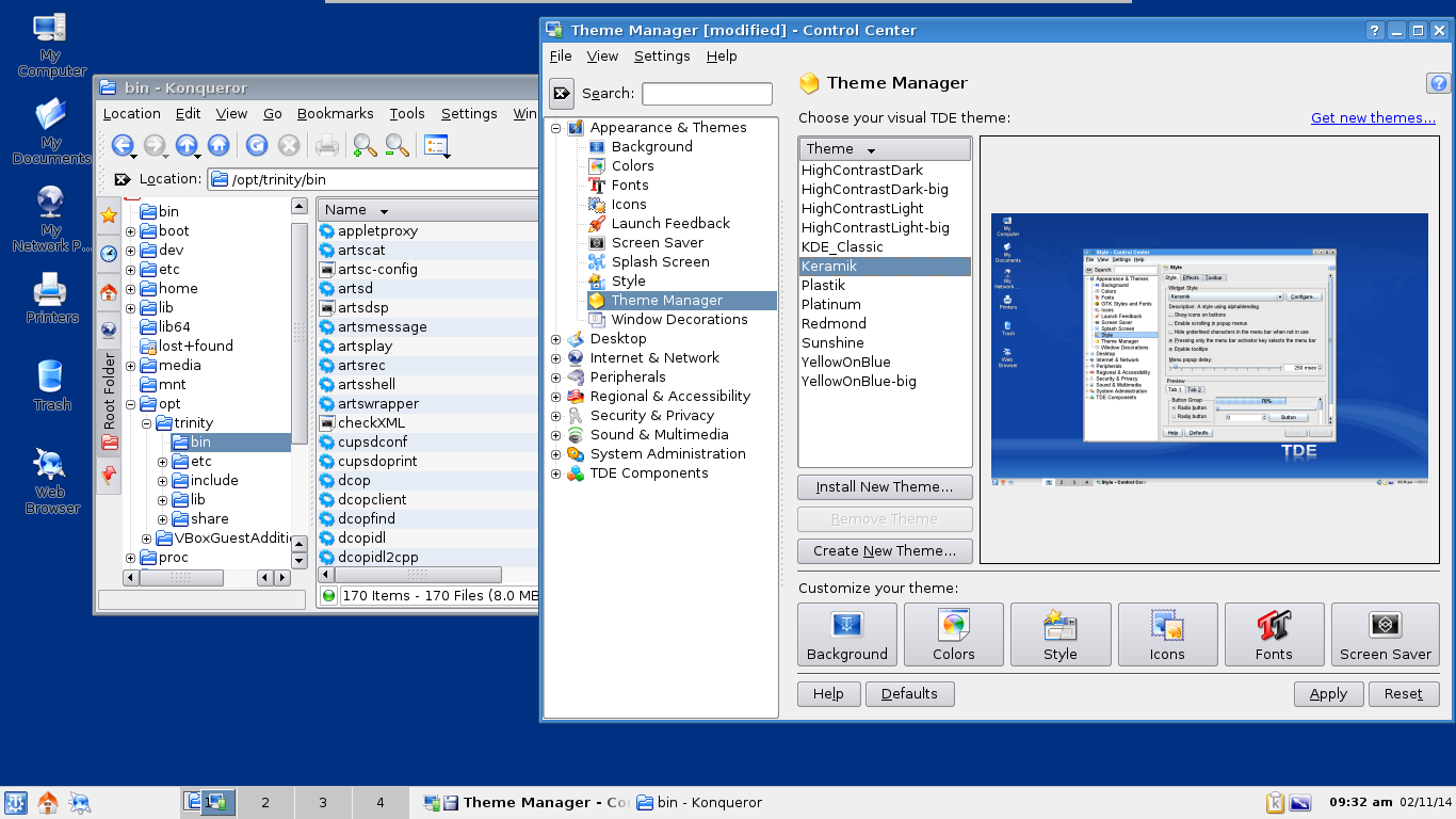
Depending on your chosen desktop and era, there are also things like TDE (trinity desktop environment) a fork (or spiritual successor) of the KDE 3.x environment: https://www.trinitydesktop.org/media/screenshots/large/tde3....
And if you like Gnome 2.x, there's MATE: https://mate-desktop.org/
I'd love a similar compositor for Wayland.
But if there was a good Windows 95 theme I'd probably use it.
(This is ranty but isn't really directed at the SerenityOS devs, they've delivered exactly what they promised and done a good job at it. I just wish someone, somewhere was interested in functional UI design for the current era)
I interviewed Andreas about it some time ago: